
Don’t miss more branding talk on our Peel Good podcast!
What is a brand?
When you think of branding, what comes to mind? Most likely, it’s a logo, a graphic, a name. Perhaps it’s a color or a style. Maybe it’s a particular product or even a feeling. In reality, a brand is all of these things and more. A company’s brand is essentially how it is perceived. It’s the impression it leaves, the feeling that it evokes and the experience that it creates.
Branding then is the act of shaping how an organization or a product is perceived. And while a brand incorporates many dimensions, one if its most influential and recognizable is its visual identity. A well-crafted visual identity can immediately tell a story about what a company does and how it does it, as well as evoke the feelings, memories and experiences that build connections with an audience.
A mark for the ages
From the days of cave paintings, people have sought out symbols and marks to convey meaning or emotion. Today, our shared visual language helps us to communicate and connect globally, and in a global economy, with imagery from emojis to branded identifiers that carry meaning across languages and cultures. So, who were the original brand builders who laid the foundations for modern branding?
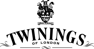
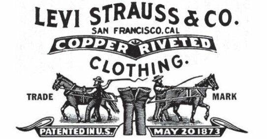
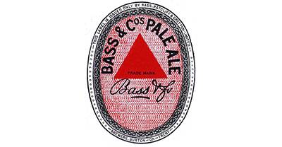
The distinction of owning the first trademarked logo goes to Bass Pale Ale. The company’s recognizable red triangle was first legally registered in 1876 amidst a swell of interest in credit for craftsmanship as mass production ramped up in the industrial age. Trademark legalities aside, the brand image often cited as the world’s oldest still in use is the horn featured in the brandmark for Stella Artois, which the company traces back to its founding in 1366 in Belgium and still features prominently today as it distributes in more than 80 countries. Other notables include Levi Strauss & Co. which introduced its signature two-horse logo in 1886 and Twinings Tea whose logo design featuring capitalized text beneath a lion crest has remained unaltered since 1887.
What is it then that has allowed these brands to stay relevant and recognizable over the span of centuries?
What makes a brand successful
Brands are as diverse as the people and companies that create them. There are common elements however that many successful brands share.
Authentic
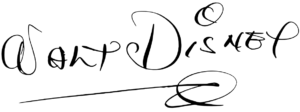
Great brand identities are authentic and personal to the company, brand, vision or person that they represent. An enduring example of this concept is the Walt Disney Company with its stylized signature logo that directly connects to its founder and his driving vision to create magic and memories.
Authenticity was a key ingredient in Clementine’s identity design for iconic food hall Marietta Square Market. Infusing the railroad-inspired character of the hall’s restored building as well as the surrounding community was a focal goal to build connection with the local audience.
The logo design features two nestled M’s connected by a central square element, directly evoking the name. At the same time, the strong vertical lines, doubled, call to mind the image of the train tracks, which run right alongside the Market, with the central point of the larger M creating a birds-eye image of a train engine headed down the tracks. Surrounding lettering and a stylized spoon and fork make clear the food connection.
Evocative
Successful brand identities evoke a psychological or emotional reaction. Often this is through the use of color. Historically, for example, many fast food brands have used red or yellow which are known to trigger hunger, happiness and urgency. Blue is frequently used by financial brands to convey confidence and trustworthiness. Brands can also use imagery to create feelings – think of the World Wildlife Fund’s lovable panda. Or the design itself can create an emotional reaction as is the case with the logo for The Bahamas with its fresh, colorful, dynamic shapes that evoke fun, activity and of course the islands themselves.


Clementine’s logo design for Nest Residential demonstrates evocative design, building on the “Nest” name and the idea of home as a haven, the logo design features a house formed from one single line – symbolizing the continuity of home as it transforms over time – a nod to the company’s focus on reclaiming and refreshing older homes into authentic yet modern living spaces for the millennial buyer.
A bird nestled in the heart of the design feels fresh and friendly in a bright shade of orange that evokes energy and urbanism. The silhouette itself was pulled from a photograph taken by the company’s owner as a personal signature.
Targeted
A successful brand should speak directly to its intended audience. While this might seem obvious, it is often a surprising stumbling block for brand builders who are unable to differentiate their own tastes or preferences from those of their audience. A clear understanding of your audience is key to making sure that every element of your brand speaks directly to them. Take for example Metallica which addresses its audience in every dimension from its bold, sharp approach to the text of the word itself.
Tuned
The key determining factor in brand success is connection. No matter how visually appealing (or unappealing) a brand’s identity may be, the ultimate test is how well it resonates and connects with its audience.
Can I get a do over?
Not every brand identity design hits the mark. And often it is wise for a brand’s identity to evolve and adapt with its offerings and its audience. So how can a brand successfully approach changing something that is so central to its core?
To be reminded of the many potential pitfalls of rebranding, look no further than the infamous “Gapgate” of 2010 when retail giant Gap unveiled a new logo. The new design was quickly and almost universally reviled by the Gap faithful – ultimately leading to a quick retreat to the original logo just six days later and the resignation of the company’s North American division president.
While the general clumsiness of “Gapgate” (as the company announced, backtracked, impulsively attempted to crowdsource other ideas and quickly withdrew) has led many to question whether or not it was in fact a PR stunt rather than a real rebranding effort, it is a lesson in the many important considerations for a brand as it seeks to evolve.
Keeping the brand’s audience at the center of any redesign or refinement is crucial. And often, small strategic steps are the best way for a brand’s identity to evolve and grow over time without breaking its core connection to its audience. MasterCard is an excellent example of identity evolution as its logo mark has slowly simplified, streamlined, modernized and ultimately leaned into its icon rather than its text, reversing the design’s original focus.
The same principle of evolution was applied for Clementine client Penon Partners, a French consulting company as it embarked on its first launch into the American market. Penon’s initial logo design was inspired by its name “penon” which in sailing refers to small banners or flags used to indicate the direction of the wind – apropos for the consulting firm whose mission is to provide expert guidance for its clients’ business transformations.
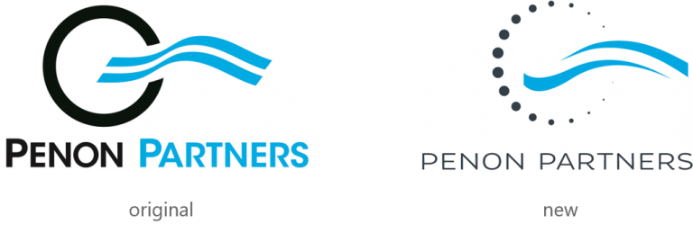
To take the firm’s identity to the next level, Clementine refined the logo into a sleek new design transforming the outer circle into a series of dots which feel dynamic and evoke technology reflecting Penon’s specialized expertise in the technology, telecommunications and IOT arenas. A streamlined modern font choice furthers the technology tie while the blue wave of the conceptual penon itself adds fluidity and movement to the design.
Hitting the mark
Successfully hitting the mark means answering for a number of the aforementioned elements. From authenticity to evolution, the newly redesigned identity for Rolls Royce does just that. Ahead of the launch of their new model Ghost, their Chief Executive Officer released an open letter describing their desire to bring focus back to the simplicity of their quality features that originated with the brand so many years ago.
The new logo does just that, tying into the iconic elements of the classic brand, exuding elegance, grace, and vintage sentiment coupled with a refreshingly modern and minimalist spin – the female “Spirit of Ecstasy” icon leading the brand into to the future. They’ve also redefined their color palette to a rich and regal purple paired with a rose gold accent, again harkening back to the birth of the original brand in 1904.
Building brand power
At its heart, a brand is the very essence of who and what a company is. Consistency then is critical in protecting the value and character of any brand. From top to bottom, every visual mark, communication, environment and experience should be driven by and edify the overall brand. Branding is a process that requires both strategy and discipline to build awareness and long-term loyalty. And that’s how branding professionals can provide critical support to make sure that your investment in branding is targeted and effective to produce the results you need.
You can’t put a price on a truly authentic brand and the powerful connections it creates. A compelling brand can be the single most valuable asset that a business or organization owns, its ultimate competitive advantage in translating perceptions into performance.
Ready to talk shop on branding? Connect with Clementine today!