
Brighton Branding Identity
Client | Brighton, Atlanta, GA
By Clementine | Naming, Identity Design, Signage Design, Marketing Collateral and Communications
The Story
Brighton is a unique new opportunity in Atlanta’s residential real estate market offering the comfort of a traditional neighborhood experience with the flexibility of rental. The combination of all new and well-appointed townhomes with a neighborhood club, pool and more is designed to appeal to a variety of demographics who choose to rent but do want to live in a conventional apartment community.
The Work
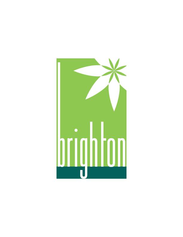
The brand’s central identity was designed to appeal to a broad cross-section of audiences balancing a traditional warmth with a current, fresh energy. The chosen moniker “Brighton” is at once timeless but airy and light.
In the logo mark, a vibrant green color palette is refreshing, crisp and vital while a deeper bluish-green grounds the design. The modern font styling creates a current yet comfortable feel. The iconic graphic element is botanical-inspired to add life and softness.
The Results
Brighton stands apart in the market with its comfortably modern vibrancy that differentiates it from its surroundings. With full market release approaching, the concept’s initial release has been warmly embraced and generated robust consumer interest.
![$galItems['alt']](https://clementinecreativeagency.com/wp-content/uploads/2020/09/BrightonSignConcept.png)
![$galItems['alt']](https://clementinecreativeagency.com/wp-content/uploads/2020/09/BrightonWebConcept.png)