The Evolution of an Award-Winning Logo
A logo design is more than just a pretty face. Immense thought goes into each and every stroke, color and font chosen to represent a company in its stylistic form. So what does the Marietta Square Market logo really mean? We break it down piece by piece.

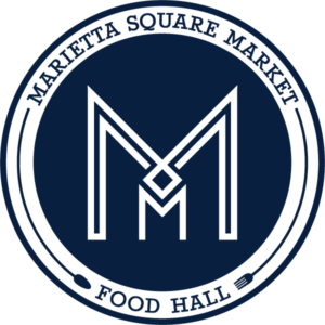
At the center of the logo lies the Square. Much like the Marietta Square, which is the epicenter and hub of historic Marietta entertainment, all is created off of the tiny Square. Marietta residents and friends are extremely passionate and supportive of the Square, just as the creators of Marietta Square Market are proud to be a part of a group of lucky merchants who call the Square home.

Further paying homage to Marietta and its history, the parallel lines throughout the design symbolize the railroad running through Marietta, between the Market and the Square. In addition to the proximity of the tracks, these parallel lines pay tribute to the tracks on which Marietta Square Market’s historic, renovated trolley would have traveled in the early 1900s.

The stylized initials MM serve as a stamp or monogram alluding to the name, Marietta Square Market, while the Square is represented by the square icon. The monogram infuses Deco inspired lines, a style reminiscent of grand train stations. Furthermore, the M’s fit in to each other, creating negative space that gives the icon shape, depth and intrigue. This symbol resembles a bird’s eye view of a train traveling down the tracks where the two legs of the large M resemble train tracks and the apices of the M join to form the pilot.

Finally, and as a late addition, the stylized fork and spoon iconography wrapping the logo connects the name at the top of the badge with the words ‘food hall’ to complete the overall message of the Market’s business and purpose. These icons visually represent serving and enjoying food, as a fork and spoon would lie on a round plate.
With its proximity to the Marietta Square, incorporating location and history was extremely important in keeping the historic identity of Marietta Square Market at the forefront. Secondly, representing its business as a food hall was important to differentiate the Market from other businesses tied to the Square.
Not only is our client happy with the thought behind the logo design, but this mark was also identified as a Hermes Award winner for Logo Design.
What is the most memorable piece of this logo design? Tweet it to us at @cca_creates.
