the whole package
Piedmont National rebranding
client
Piedmont National, Atlanta, GA
services
the story
Family-owned since 1950, Piedmont National is an innovative packaging and supply chain solutions company blending packing and shipping materials, shipping line and ecommerce automation, proprietary technology and personal service. Approaching its 75th anniversary, the company saw the milestone as an opportunity for a brand refresh reflecting its ongoing legacy of innovation and evolution.
the work
For nearly 75 years, Atlanta-based Piedmont National has built a legacy of success with a focus on service. As the company’s 75th anniversary approached, it sought a corporate rebrand with a reinvigorated logo and brand identity that would reflect its role as an industry leader empowering clients with proprietary software solutions, ecommerce automations and more, while retaining the people-first focus on relationship and service that is the heart of its history as a family-owned company.
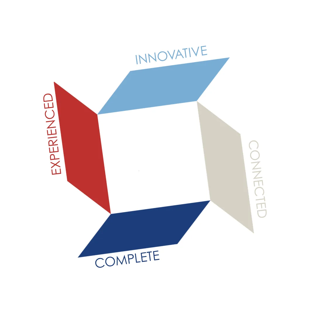
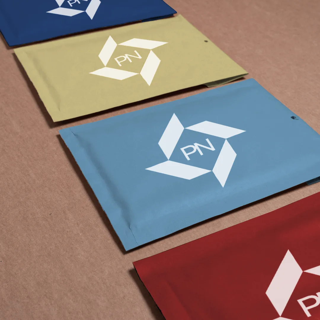
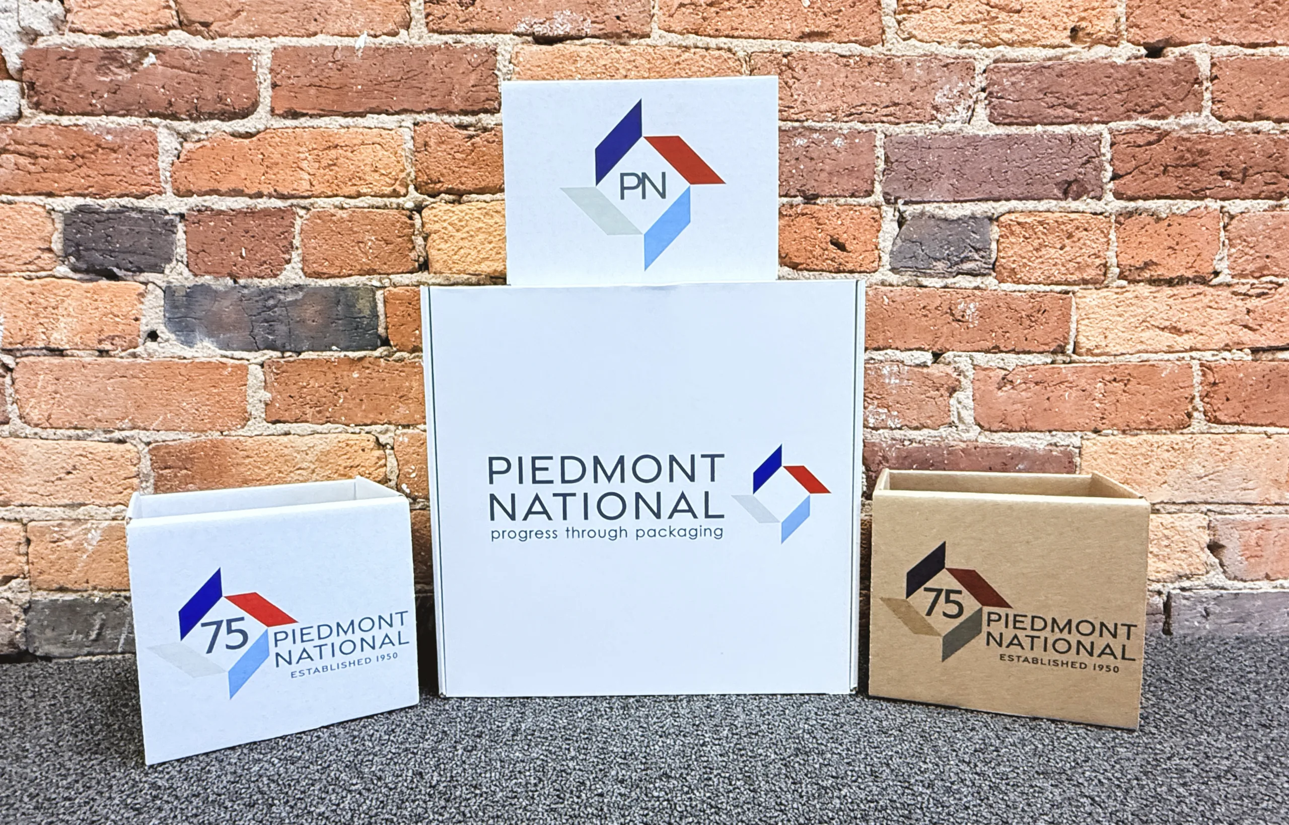
Because Piedmont National is a large organization with a long history and a diversity of offerings, it was imperative to first build a strong foundation of research and to re-distill the brand’s values and unique selling propositions so they could be communicated in a clear, concise, and compelling way to potential clients as well as to existing and new employees. The result was a simple set of four words that delineate the characteristics that set Piedmont National apart: Experienced. Innovative. Connected. Complete. Once these brand pillars were firmly established, with the appropriate evolution of the brand voice taking shape, creative work on an all-new logo design sought to infuse the company’s brand with fresh meaning. An eye-catching icon resembles a top-down view of the four flaps of a box, speaking directly to the company’s packaging core, while also evoking forward motion and momentum thanks to the intentional angles that create an illusion of clockwise rotation, always pushing ahead.
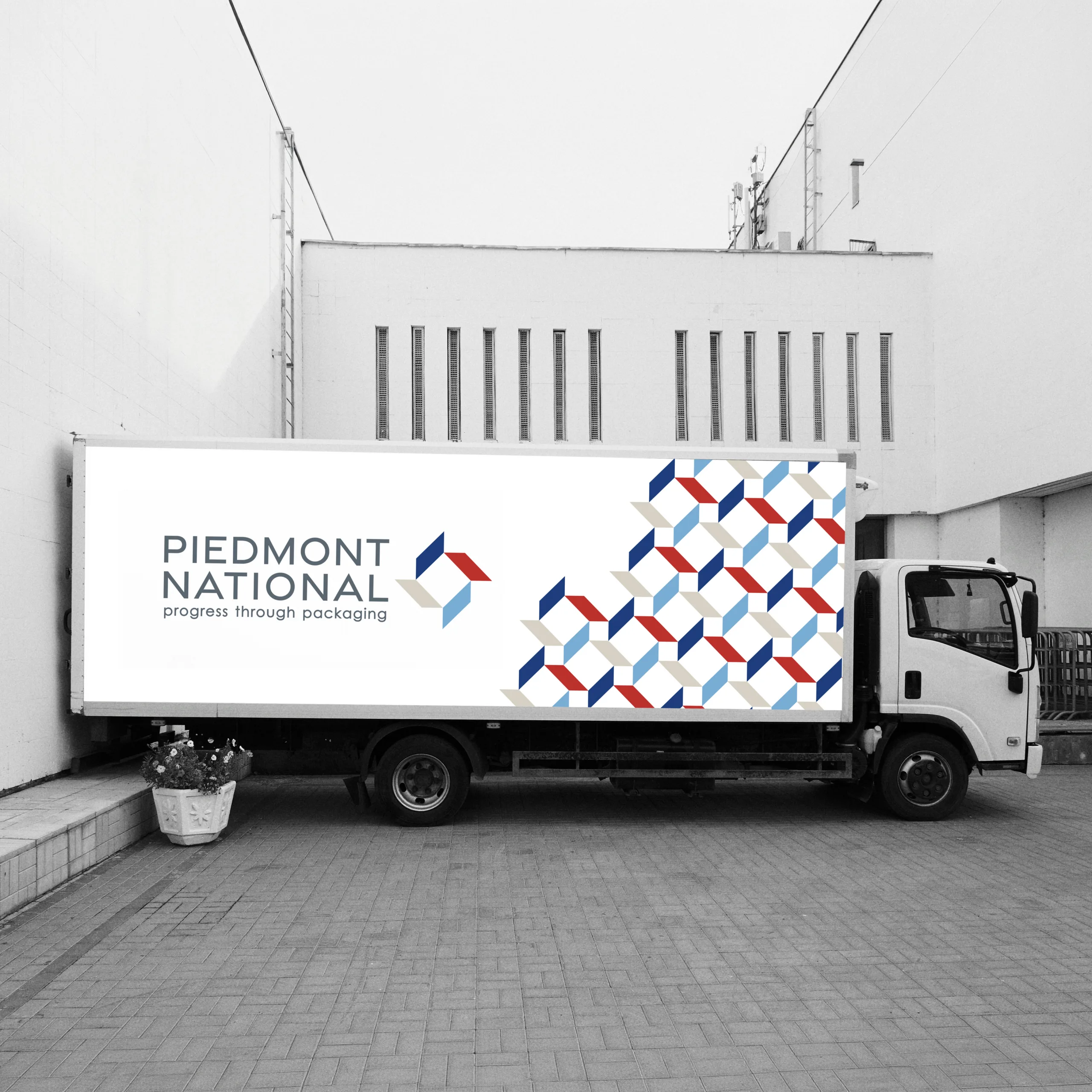
The four flaps of the icon further represent the brand’s four key categories of offerings: Materials, Automation, Service, and Technology. A different color for each area pulls from the central logo design and into supporting materials by category, strengthening the cohesion of the entire brand suite. The color palette further ties to the brand’s central selling propositions, with the red reflecting experience as a legacy color from the previous branding, a bright blue evoking the optimism and creativity of innovation, a soft taupe creating the warmth of connection, and finally a deep, rich blue calling up confidence and stability in the brand’s comprehensive capabilities. The logo font is clean and bold but personable, while a newly minted tagline, “progress through packaging,” now positions the brand as forward-thinking and ready to take on the next 75 years of evolution and growth.