polished property
Manning Properties Real Estate Branding
client
Manning Properties, Marietta, GA
services
the story
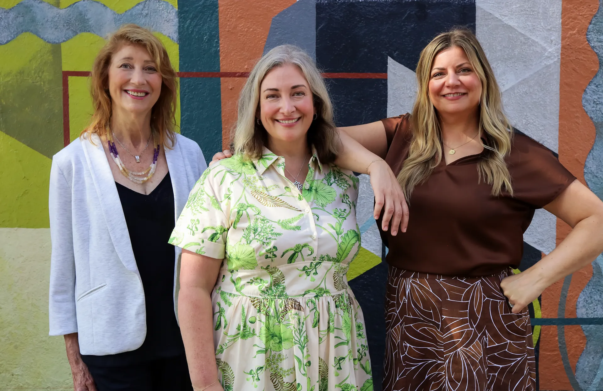
Manning Properties is a family-owned full-service real estate brokerage house in Marietta, GA with more than five decades of experience spanning both commercial and residential sales, leasing, management and appraisals.
the work
An iconic name in Marietta since 1972, family-owned Manning Properties has always had a vision for the future. As the next generation leads the business forward, the time had come to refine and update the brand’s visual presentation to reflect its lasting appeal and commitment as an active part of the community landscape.
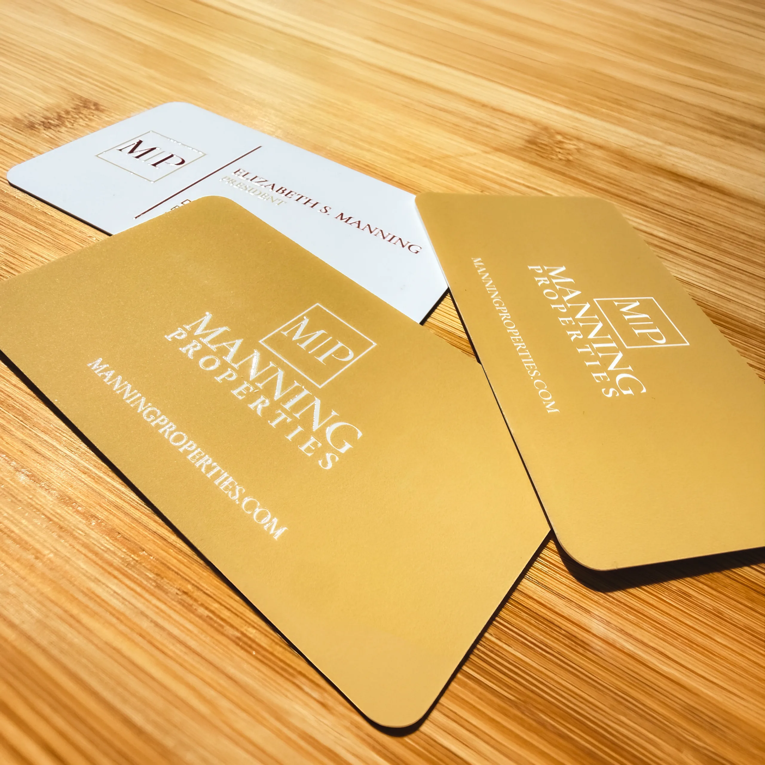
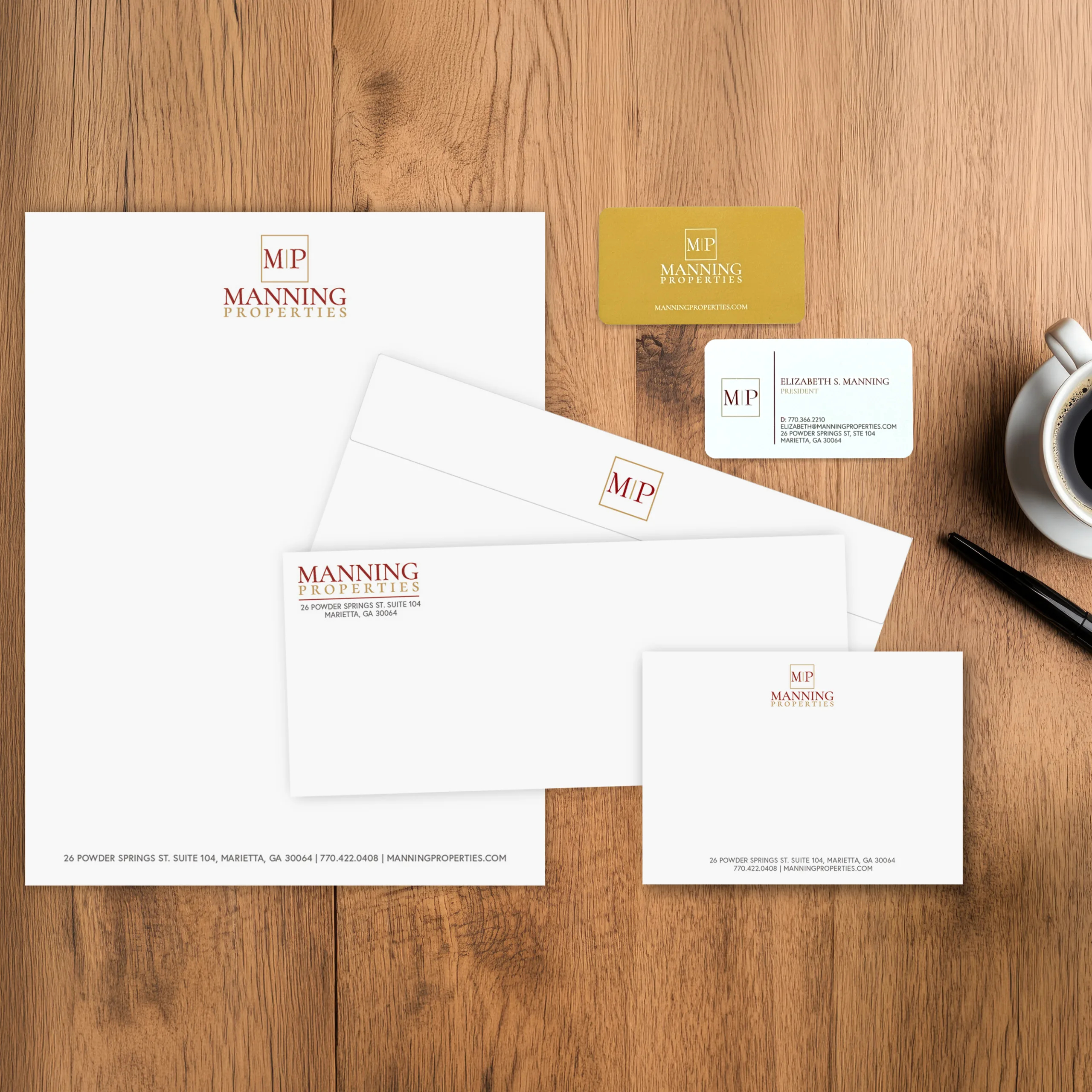
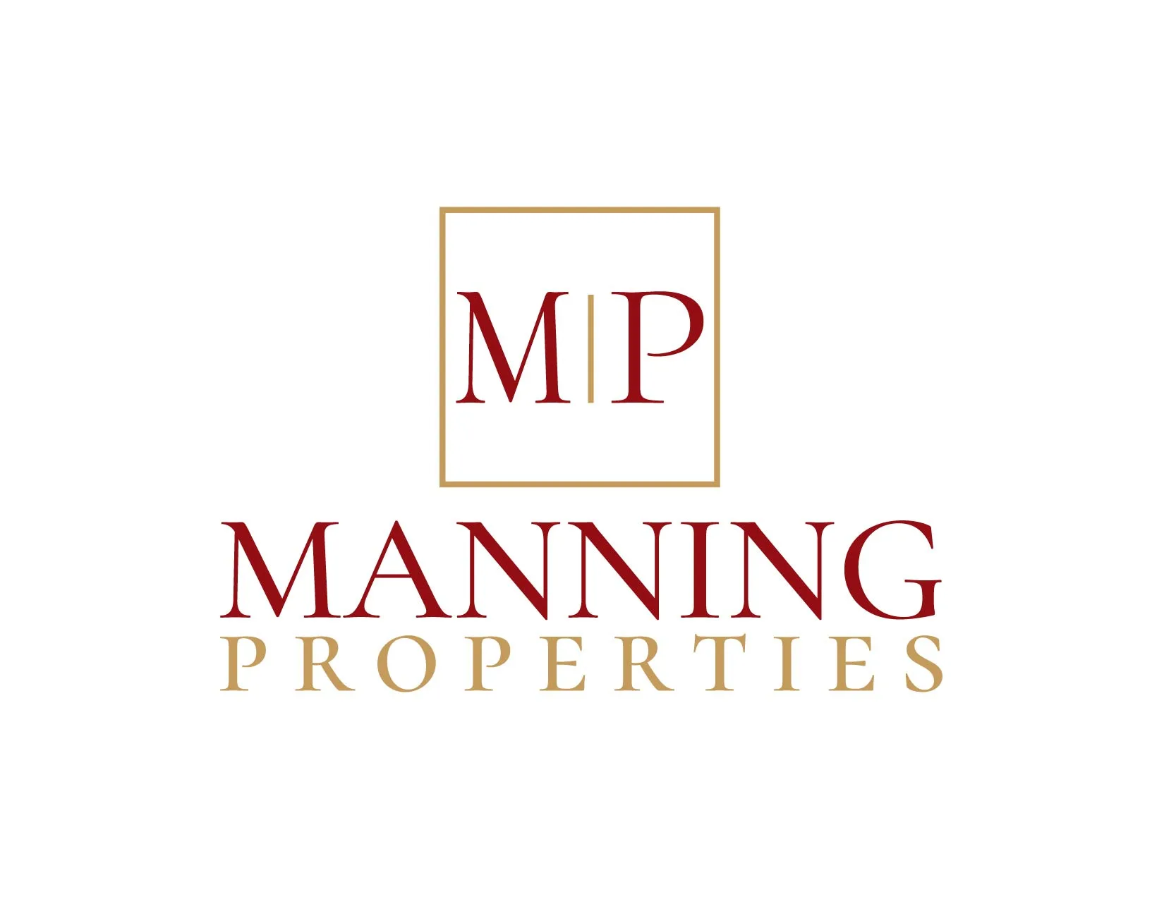
The new logo design for Manning Properties is an organic evolution of the long-standing, well-recognized real estate brand. The central “M | P” monogram element was retained; however the lettering style was refined for a timeless look, with intentional placement that gives precedence to the Manning family name. The brand’s pre-existing red and gold color palette was adapted into deeper, richer, earth tones evoking terra cotta and gold for an elevated feel. Carried through the full brand identity and print collateral, the result is unmistakably Manning and built to stand the test of time as the brokerage moves into its next chapter.